

iOS App Orientation Guide
Introduction
Chartbeat’s iOS app gives you all the real-time power of the Chartbeat Dashboard on the go so that you’re always in the loop with how well your content is performing across the web. Free to all Chartbeat users, after you download the iOS app here in the Apple Store, simply login with the same Chartbeat username and password you use to login to your Dashboard.
Navigation
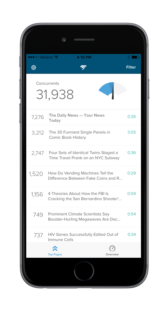
The app is separated into two main tabs Top Pages and Overview. The Top Pages tab is the screen that loads when the app opens and shows you your total audience size and the most popular articles by concurrents at a moment's glance.
The overview tab is where you will find your concurrents by traffic source graph, metrics like engaged time and recirculation, referrer information, and a breakdown of your audience by loyalty and device type.
Additionally on the top menu you’ll see the filter button on the right, and the settings cog on the right. Tapping filter lets you add a filter (everything from sections and authors to traffic sources and referrers) and the settings page is where you can switch between any number of domains you have access to and sign out.
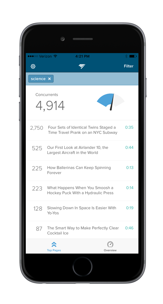
Top Pages
The top pages tab shows you your total audience size and ranks the most popular articles by concurrents so you can see at a glance which stories are grabbing the most attention, and with their average engaged time on the right, which are keeping that attention the best.
Just like the browser-based Dashboard, if you want to get a deep dive on a given story, just tap it. You’ll zoom in and get just the data for that article; everything from the concurrents graph and traffic sources, to loyalty and device type. And you can even swipe the graph to filter by a traffic source.
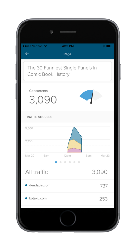
And with the ‘Open in Browser’ button at the very bottom you can jump right to that page in your phone’s default browser app.
Overview
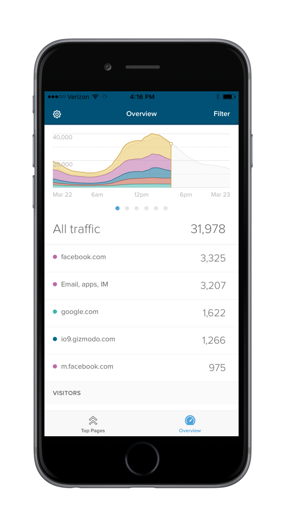
The overview tab gives you the highest level look at who your current audience is—where they came from, how long they’re engaging, and even loyalty and device metrics.
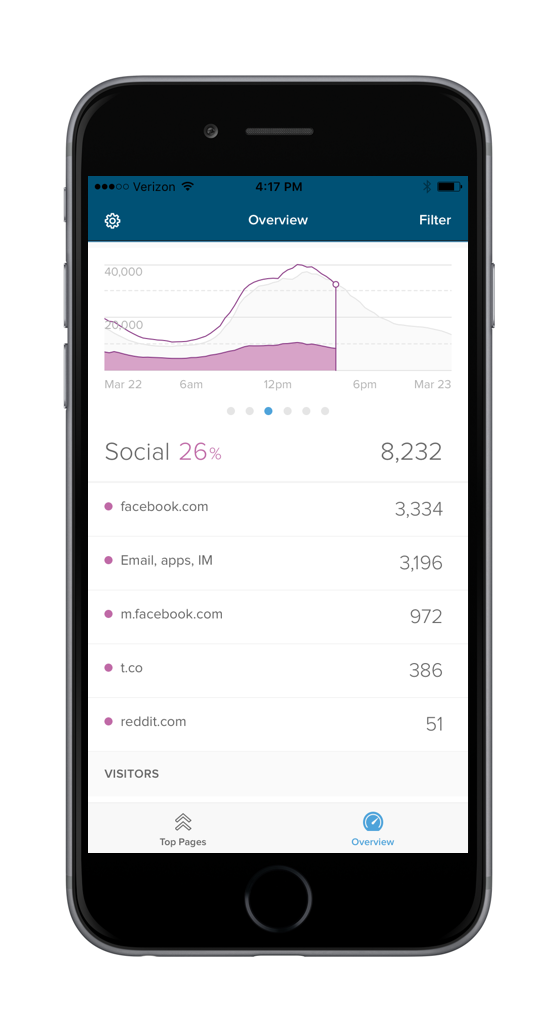
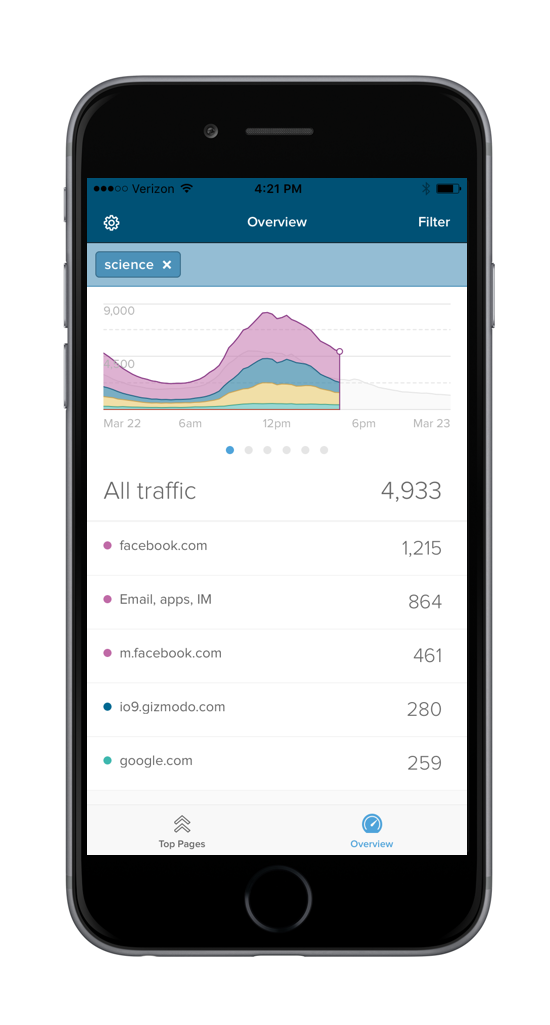
The graph at the very top is the concurrents by traffic source graph, which gives you a sense of the traffic pattern on your site over the course of the day. Swipe left on the graph and it will break out the entire overview tab into the one of the five Chartbeat traffic sources. The first traffic source it turns into will always be your largest traffic source by percentage, and if you keep swiping, it will continue to cycle through traffic sources in descending order.
Beneath the graph you get a quick look your total audience size, as well as the top five highest performing referrers by concurrents for a quick insight into where the majority of your audience is coming from.
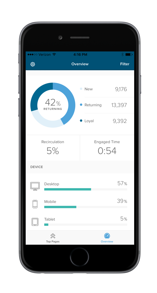
Next you can see the three loyalty buckets—new, returning, and loyal—in a circle graph, with the largest loyalty group highlighted in the center. And beneath that you can see your entire audience’s average engaged time and recirculation.
The last section of the overview tab breaks out your audience into device type groups, so you can get an idea of how much of your audience is seated at their computer, and how much is using their phone on the go.
Apply a Filter
The power of Chartbeat is that all members of the team can filter their Dashboard to only show them data for the audience groups that matter most to them.
In the iOS app, just tap the filter button on the right-hand side of the top menu, and you can select any combination of a section, author, traffic source, or referrer, and segment the data that appears on both the both overview and top pages tabs.
Settings
Finally, when you tap the settings cog, you can switch between any number of domains you have access to and sign out.